
My previous ramblings about Luminosity Masks:
The rest of my GIMP tutorials can be found here:
The rest of my GIMP tutorials can be found here:
If you remember from my previous look at Luminosity Masks, the idea is to create masks that correspond to different luminous levels in your image (roughly the lightness of tones). Once you have these masks, you can make adjustments to your image and isolate their effect to particular tonal regions easily.
In my previous examples, I used them to apply different color toning to different tonal regions of the image, like this example masked to the DarkDark tones (yes, DarkDark):


Mouseover to change Hue to: 0 - 90 - 180 - 270
What’s neat about that application is when you combine it with some Film Emulation presets. I’ll leave that as an exercise for you to play with.
In this particular post I want to do something different.
I want to make some eyes bleed.
In the same realm of bad tone-mapping for HDR images (see the first two images here) there are those who sharpen to ridiculous proportions as well as abuse local contrast enhancement with Unsharp Mask.
It was this last one that I was fiddling with recently that got me thinking.
Local Contrast Enhancement with Unsharp Mask
If you haven’t heard of this before, let me explain briefly. There is a sharpening method you can use in GIMP (and other software) that utilizes a slightly blurred version of your image to enhance edge contrasts. This leads to a visual perception of increased sharpness or contrast on those edges.It’s easy to do this manually to see sort of how it works:
- Open an image.
- Duplicate the base layer.
- Blur the top layer a bit (Gaussian blur).
- Set the top layer blend mode to “Grain Extract”.
- Create a New Layer from visible.
- Set the new layer blend mode to “Overlay”, and hide the blurred layer.
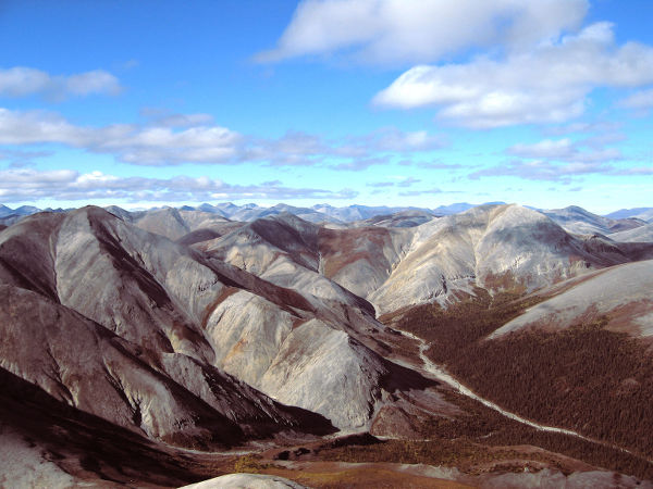
So let’s have a look at an image from a nice Fall day at a farm:

I can apply Unsharp Mask through the menu:
Filters → Enhance → Unsharp Mask...
Below the preview window there are three sliders to adjust the effect: Radius, Amount, and Threshold.
Radius changes how big a radius to use when blurring the image to create the mask.
Amount changes how strong the effect is.
Threshold is a setting for the minimum pixel value difference to define an edge. You can ignore it for now.
If we apply the filter with its default values (Radius: 5.0, Amount: 0.50), we get a nice little sharpening effect on the result:

Unsharp Mask with default values
(mouseover to compare original)
It gives a nice little “pop” to the image (a bit much for my taste). It also avoids sharpening noise mostly, which is nice as well.
So far this is fairly simple stuff, nothing dramatic. The problem is, once many people learn about this they tend to go a bit overboard with it. For instance, let’s crank up the Amount to 3.0:

Don’t do this. Just don’t.
Yikes. But don’t worry. It’s going to get worse.
High Radius, Low Amount
So I’m finally getting to my point. There is a neat method of increasing local contrast in an image by pushing the Unsharp Mask values more than you might normally. If you use a high radius, and default amount you get:
Unsharp Mask, Radius: 80 Amount: 0.5
(mouseover to compare original)
It still looks like clown vomit. But we can still gain the nice local contrast enhancement and mitigate the offensiveness by turning the Amount down even further. Here it is with the Radius still at 80, but the Amount turned down to 0.10:

Unsharp Mask, Radius: 80 Amount: 0.10
(mouseover to compare original)
Even with the Amount at 0.10 it might be a tad much for my taste. The point is that you can gain a nice little boost to local contrast with this method.
Neat but hardly earth-shattering. This has been covered countless times in various places already (and if this is the first time you’re hearing about it, then we’re learning two new things today!).
We can see that we now have a neat method for bumping up the local contrast of an image slightly to give it a little extra visual pop. What we can think about now is, how can I apply that to my images in other interesting ways?
Perhaps we could find some way to apply these effects to particular areas of an image? Say, based on something like luminosity?
Clarity in Lightroom
From what I can tell (and find online), it appears that this is basically what the “Clarity” adjustment in Adobe Lightroom does. It’s a Local Contrast Enhancement masked in some way to middle tones in the image.Let’s have a quick look and see if that theory holds any weight. Here is the image above, brought into Lightroom and with the “Clarity’ pushed to 100:

From Lightroom 4, Clarity: 100
This seems visually similar to the path we started on already, but let’s see if we can get something better with what we know so far.
Clarity in GIMP
What I want to do is to increase the local contrast of my image, and confine those adjustments to the mid-tone areas of the image. We have seen a method for increasing local contrast with Unsharp Mask, and I had previously written about creating Luminosity Masks. Let’s smash them together and see what we get!If you haven’t already, go get the Script-Fu to automate the creation of these masks (I tend to use Saul’s version as it’s faster than mine) from the GIMP Registry.
Open an image to get started (I’ll be using the same image from above).
Create Your Luminosity Masks
You’ll need to generate a set of luminosity masks using your base image as a reference. With your image open, you can find Saul’s Luminosity Mask script here:Filters → Generic → Luminosity Masks (saulgoode)
It should only take a moment to run, and you shouldn’t notice anything different when it’s finished. If you do check your Channels dialog, you should see all nine of the masks there (L, LL, LLL, M, MM, MMM, D, DD, DDD).

Luminosity Masks, by row: Darks, Mids, Lights
Enhance the Local Contrast
Now it’s time to leave subtlety behind us. We are going to be masking these results anyway, so we can get a little crazy with the application in this step. You can use the steps I mentioned above with Unsharp Mask to increase the local contrast, or you can use G'MIC to do it instead.The reason that you may want to use G'MIC instead is that to increase the local contrast without causing a bit of a color shift would require that you apply the Unsharp Mask on a particular channel after decomposition. G'MIC can automatically apply the contrast enhancement only on the luminance in one step.
Let’s try it with the regular Unsharp Mask in GIMP. I’m going to use similar settings to what we used above, but we’ll turn the amount up even more.
With your image open in GIMP, duplicate the base layer. We’ll be applying the effect and mask on this duplicate over your base.
Now we can enhance the local contrast using Unsharp Mask:
Filters → Enhance → Unsharp Mask...
This time around, we’ll try using Radius: 80 and Amount: 1.5.

Unsharp Mask, Radius: 80, Amount: 1.5. My eyes!
Yes, it’s horrid, but we’re going to be masking it to the mid-range tones remember. Now I can apply a layer mask to this layer by Right-clicking on the layer, and selecting “Add Layer Mask...”.
Right-click → Add Layer Mask...
In the “Add a Mask to the Layer” dialog that pops up, I’ll choose to initialize the layer to a Channel, and choose the “M” mid-tone mask:

Once the ridiculous tones are confined to the mid-tones, things look much better:

Unsharp Mask, Radius: 80, Amount: 1.5. Masked to mid-tones.
(mouseover to compare original)
You can see that there is now a nice boost to the local contrast that is confined to the mid-tones in the image. This is still a bit much for me personally, but I’m purposefully over-doing it in an attempt to illustrate the process. Really you’d want to either tone-down the amount on the USM (UnSharp Mask), or adjust the opacity of this layer to taste now.
So the general formula we are seeing is to make an adjustment (local contrast enhance in this case), and to use the luminosity masks to give us control over where the effect is applied.
For instance, we can try using other types of contrast/detail enhancement in place of the USM step.
I had previously written about detail enhancement through “Freaky Details”. This is what we get when replacing the USM local contrast enhancement with it. Using G'MIC, I can find “Freaky Details” at:
Filters → G'MIC
Details → Freaky details
Details → Freaky details
I used an Amplitude of 4, Scale 22, and Iterations 1. I applied this to the Luminance Channels:

Freaky Details, Amplitude 4, Scale 22, Iterations 1, mid-tone mask
(mouseover to compare original)
Trying other G'MIC detail enhancements such as “Local Normalization” can yield slightly different results:

G'MIC Local Normalization at default values.
(mouseover to compare original)
Yes, there’s some halo-ing, but remember that I’m purposefully allowing these results to get ugly to highlight what they’re doing.
G'MIC Local Variance Normalization is a neat result with fine details as well:

G'MIC Local Variance Normalization (default settings)
(mouseover to compare original)
In Conclusion
This approach works because our eyes will be more sensitive to slight contrast changes as they occur in the mid-tones of an image as opposed to the upper and lower tones. More importantly, it’s a nice introduction to viewing your images as more than a single layer.Understanding these concepts and viewing your images as the sum of multiple parts allows you much greater flexibility in how you approach your retouching.
I fully encourage you to give it a shot and see what other strange combinations you might be able to discover! For instance, try using the Film Emulation presets in combination with different luminosity masks to find new and interesting combinations of color grading! Try setting the masked layers to different blending modes! You may surprise yourself with what you find.
Help support the site! Or don’t!
I’m not supporting my (growing) family or anything from this website. Seriously.There is only one reason I am writing these tutorials and posts:
I love doing it.
Technically there is a second reason: to give back to the community. Others before me were instrumental in helping me learn things when I first got started, and I’m hoping to pay it forward here.If you want to visit an ad, or make a donation, or even link/share my content, I would be absolutely grateful (and tickled pink). If you don’t it’s not going to affect me writing and posting here one bit.
I’ll keep writing, and I’ll keep it free.
If you get any use out of this site, I only ask that you do one thing:
pay it forward.

Must try this out and his other tutorials
ReplyDeleteHope they don't disappoint! :)
DeleteGreat article!
ReplyDeleteEver since I read your previous articles about Luminosity Masks, I became a frequent user of this feature.
Besides Luminosity Masks - Saulgoode, I also like to play with the Zone System Separetor.
One issue that bothered me a little, was to see that even using the same values, my image gives a different outcomes from that seen here on the blog.
I used the same picture (nice Fall day at the farm)
The unsharp mask default values, shows minimal difference, a slight halo is noticed.
When I crank up the Amount to 3.0, this halo is yelling!
"I want to make some eyes bleed." You said.
With Unsharp Mask Radius: 80 Amount: 0.5 the result is more similar to the article, but with a slightly warmer tone.
Maybe the version of my Unsharp Mask is responsible for it. Or my version of Gimp 2.8.2. I do not know.
This is just one isolated comment, since I can work around the problem visually and select other values.
Thanks for sharing another great technique!
I knew this would bite me in the butt. I was also using a higher resolution version of the image than google will show. The max size of the google version is 2048x2048, while mine was quite a bit bigger (around 3600x3600 iirc).
DeleteAs such the values should be scaled accordingly. (Sorry for the confusion!)
Hi Meho,
ReplyDeleteDid you perform these steps?
"CREATE YOUR LUMINOSITY MASKS
You’ll need to generate a set of luminosity masks using your base image as a reference. With your image open, you can find Saul’s Luminosity Mask script here:
Filters → Generic → Luminosity Masks (saulgoode)" ?
Hi Patrick,
ReplyDeleteCould you make a tutorial on noise reduction? I have lots of photos taken at very high ISO (1600-3200) and it is killing me to process them.
BTW, thanks for all the helpful techniques.
Hi! I actually have a post in the queue about using anisotropic smoothing in G'MIC for noise reduction, but have gotten sidetracked lately with something. I'll try to push it up the queue and get it written soon!
DeleteHi, i get an unbound variable error with the luminosity scripts, regarding the INSERT lines :
ReplyDeletegimp-image-insert-channel image
Thank you for this article, really helped me achieve the effect I was looking for. Created my own "luminosity mask" within the range I wanted to work on, and used it as a layer mask for the "over-processed" version of the image. Seemed to work as I'd hoped. Thanks!
ReplyDelete