

What I feel many of posts become...
My intention at this point is to document some sort of workflow that might prove useful to others (and myself - you'd be surprised at how much I learn writing these posts...). So I'll touch on the final topic I wanted to talk about, blending different bits from various layers and working through a couple of examples.
The rest of my GIMP tutorials can be found here:
Getting Around in GIMP
The rest of the tutorials in this series are here:
B&W Conversion - Part 1 (Desaturate)
B&W Conversion - Part 2 (Channel Mixer)
B&W Conversion - Part 3 (Decompose)
B&W Conversion - Part 4 (Pseudogrey, c2g, Blending)
Getting Around in GIMP
The rest of the tutorials in this series are here:
B&W Conversion - Part 1 (Desaturate)
B&W Conversion - Part 2 (Channel Mixer)
B&W Conversion - Part 3 (Decompose)
B&W Conversion - Part 4 (Pseudogrey, c2g, Blending)
Bits and Pieces
If you'll recall in Part 3 of this series, I had created a small Script-Fu to automatically decompose an image into various color component decompositions. I think this is a handy script to use if you're still finding your own workflow for grayscale conversions.What's nice about it is that it will automatically generate a handful of automatic conversions for you as layers on your image. This way, you can visually inspect the results and find areas from each conversion that you like. Then you can use Layer Masks (you can go review my old Layer Masks tutorial to brush up if you'd like) to isolate specific areas and to blend it with others.
Enough talk, let's dive into an example...
Pretty Women
Well, pretty woman, but I couldn't resist a Sweeney Todd reference.
This image is from Flickr user Frank Kovalchek (Alaskan Dude). In trying to get interesting images for these tutorials, I've searched the Creative Commons licensed images on Flickr, and he shows up a lot. Frank, if you read this - thank you for sharing!
So, I thought this might be a nice image to convert. To get a feel for what is possible quickly, I'm going to run my Color Decompose script, which gives me this:

One of the reasons I chose this image is that it allows us to investigate a couple of points mentioned earlier in this series. I want to keep as high a tonal density as possible in the image to help impart a sense of texture and detail. I also want to highlight some parts of the image for their best qualities.
The Scarf
So in this image, I want to keep the texture and detail of the scarf while at the same time to emphasize and accentuate the quality of the models skin. So I want to inspect these results with an eye towards these qualities (this is all highly subjective, of course, but gives us a good place to start from).So I ask myself:
"Which of these results produces the best quality/texture in the fabric of the scarf?"
I narrowed it down to the Luma Y709F, Luma Y470F, and HSL-L. Of those, I personally like the look of the Luma Y709F. So this becomes my base layer that I will start building on. (Part of the reason is that aesthetically I want focus on the models face, but still retain texture and detail of the scarf around her).

The Luma - Y709F as a "base" layer - chosen for the fabric texture.
At this point I'm more worried about the tones being there rather than a final result. Remember, we're building up the image here, and can make further corrections or enhancements later.
The Skin
Now I want to consider the model herself. There is fine detail in her skin now, but I'm looking to emphasize her overall. I'd like to get the skin a little brighter and in a higher key, to offset the dark background and the scarf.I'd also like to get it a little smoother/softer looking. Keeping that in mind, have a look at the different channel decompositions above. Not surprisingly, the Red channel looks quite pretty. This is fairly common that the red channel will be complimentary to (Caucasian) skin. (There's even a trick to using a red channel as an overlay on a color image to "enhance" the skin).
So I'm going to try this and see how I like it. I'll place the Red channel over the Luma Y709F channel, and change the blending mode to Overlay.

Luma Y709F base, with a Red channel over (set to blending mode: Overlay).
(Mouseover for comparison).
My Layers should now look like this:

Visually this appears to have a little more impact, but the skin might be blown out a little too much. I could adjust the opacity on the Red layer at this point to attenuate it's influence until I find a result I am happy with.
Remember, part of the reason this may seem to have more impact could be due to a higher contrast at the moment. Sometimes it's best to stand up and look away from the image for a while before committing to a change...
The problem is that the ratio of adjustment between the scarf and the skin might not be what I want. Adjusting the opacity might reduce the effect on the skin, but at the same time will reduce the effect on the scarf by an equal amount. What I need is some way to apply the effect stronger to the scarf or skin.
Well, this is exactly what Layer Masks are for!
Masks
I could add a mask to the red channel, then paint in a mask by hand that isolated the face, and gave a little less opacity to the scarf. It's a lot of tedious, detailed work.If only there were already a grayscale mask that isolated the face and scarf a bit. Wouldn't that be great?
Well, scroll back up and look at the RGB - Blue and RGB - Green layers. One of these looks like they would be great at isolating the face/hair from the scarf!
So that's exactly what I'm going to try. I'll copy one of those channels (I'll try the RGB - Green and see how it looks), and apply it as a layer mask to the RGB - Red channel Overlay.
So, select the RGB - Green channel, and copy it.
Add a layer mask to the RGB - Red channel. (You can initialize the mask to white.)
The mask should be automatically selected when you create it (white border), if not, click on the mask to select it.
Then paste the copied RGB - Green layer.
It should now be a Floating Selection.
Anchor the layer by right clicking on the Floating Selection layer, and choosing Anchor Layer.
When you're done, your Layers should look like this:

Edit → Copy
Add a layer mask to the RGB - Red channel. (You can initialize the mask to white.)
Right-Click Red Layer → Add Layer Mask...
The mask should be automatically selected when you create it (white border), if not, click on the mask to select it.
Then paste the copied RGB - Green layer.
Edit → Paste
It should now be a Floating Selection.
Anchor the layer by right clicking on the Floating Selection layer, and choosing Anchor Layer.
When you're done, your Layers should look like this:

Now remember, a layer mask will be more transparent the darker the color in it. The lighter areas will show more of the layer it is applied to. So in this case, lighter areas will allow more of the RGB - Red layer to show, while darker areas will show through to the layer below, Luma Y709F.
Our image at this point should look something like this:

Red Overlay masked with the Green channel (mouseover to compare w/o mask).
What this has done is to isolate the models face from the surrounding scarf a bit. You can now modify the opacity of the layer, or adjust the values of the mask using Levels or Curves to adjust the intensity of the result.
You should notice that if you modify the opacity of the RGB - Red layer, the effect will mainly be on the skin of the model thanks to our mask.
Having a look at the results, you'll notice that the scarf has become a little more flat, and the models face has brightened up. I actually like the depth that the Red overlay layer had on the scarf, and think it's a little strong on the models face.
To test something out, I'm going to try Inverting the layer mask. With the RGB - Red layer mask selected (remember - it will have a white outline in the layers window), I'll just invert the colors with:
Colors → Invert
The result should look like this:

Inverted mask results (mouseover to compare the non-inverted mask).
Here's what the layer palette looks like now:

I actually like this result at this point. The overlay and mask added some nice depth to the scarf fabric, and there is still a bit of nice effect on the skin of the model as well. I could go further and adjust the layer mask levels to decrease/increase the masking on the models skin, but I think we can leave this one as is for the moment.
Let's compare the results to a straight desaturation:

Straight Desaturation (mouseover to compare our final result).
A little fussier than a straight desaturation to get here, but I think the results are much nicer and is visually more interesting. I would probably fiddle a bit with the levels of the layer mask to adjust the contribution from the mask to the face/scarf, but this is a good starting point.
Methuselah
Well, this isn't the actual Methuselah, but it is a similar species of Bristlecone Pine (it might be the exact same species, but I'm no botanist). Once again, Flickr user Frank Kovalchek shows up in a CC-BY search for trees!
As before, I started with decomposing the image to different channels to see if there would be any interesting results I liked. I liked the initial result from Luma - Y709F again, but thought I would take a different path this time.
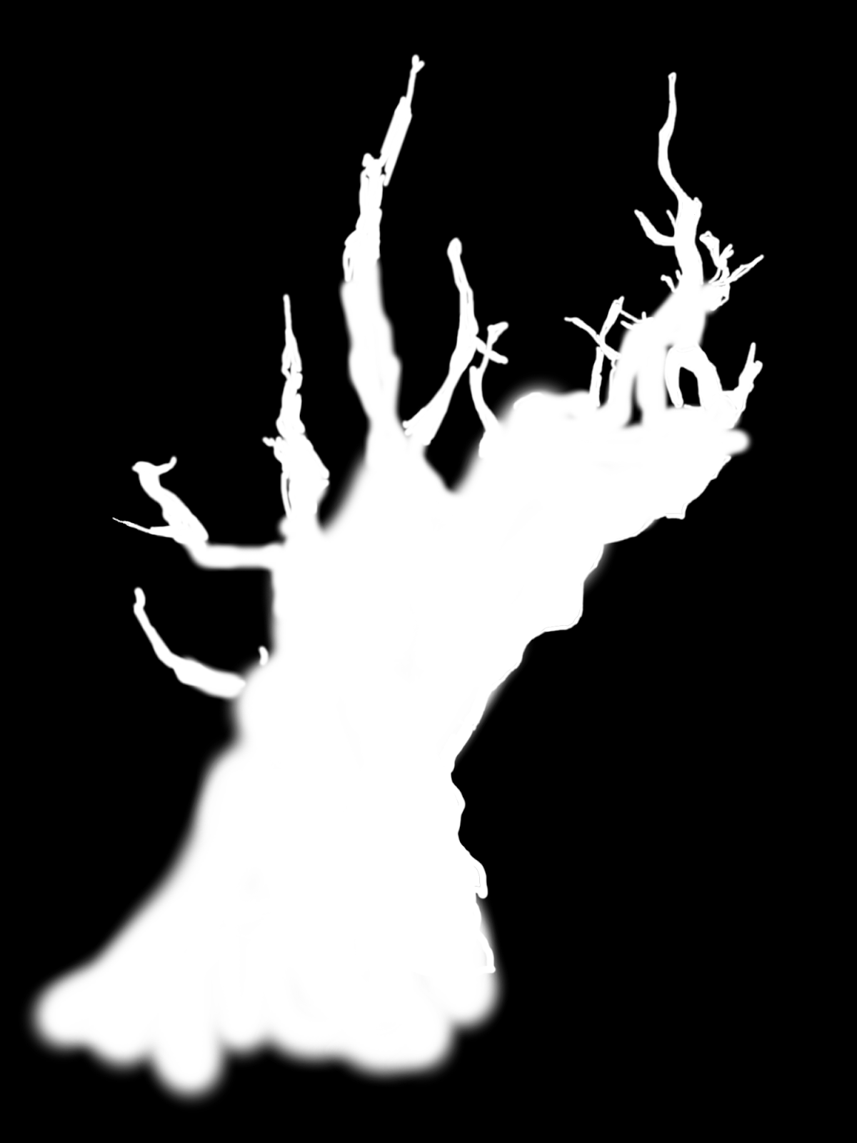
I want the main focus of this image to really be the texture of the gnarled old tree itself, and secondary the lighting of the day across the ground. Inspecting the results of my decomposition, I like the results of the green channel best on the texture of the tree. It is almost the exact same result as from the Luma Y709F.

Green channel of RGB decomposition
The things I personally don't like about the green channel is that the sky is too bright for me, and the ground could be a bit darker compared to the tree. There's also a nice feeling of light on the ground where the sunlight is reflected to the back right of the tree in the image.
Having found a nice layer for the tree texture, I am now looking for something that represents the ground and sky a little closer to what I'd like. I like a slightly darker sky, and for that the Red channel seems like a good compromise (the Blue channel was a little too noisy for me).
On inspection, I also like the Red channel for it's results on the ground near the tree (slightly darker, and retaining the reflection from the sun).

Red channel of RGB decomposition (mouseover to compare to Green channel)
So what I'd like to do is use the Red channel as a base for the sky and ground, and use the Green channel for the tree itself. Once again, layer masks seem like a good approach!
So I'll set my Green channel above my Red channel on my layer palette, and I'll add a layer mask to the Green channel, initialized to Black (full transparency). This lets all of the underlying Red channel show through.

Red channel, with Green channel over + mask
Now with the Layer Mask active (see the white outline in the above image - if it's not active, click on it), I can paint with a white color to allow that portion of the Green channel to show over the Red channel beneath it. Because I want to use the Green channel just for the tree, that is where I will paint.
There's a couple of ways you could produce the mask. As we saw earlier, I could use another channel and fiddle with the levels a bit to really get a good mask, but in this case I felt like painting. I wanted to talk about this because it's a nice way to visually inspect what your masking will do to the image, and you can tweak it as you go. You could use a different color than white to reduce the effect, as well as adjust brush dynamics for a more "painterly" feel and approach.
Here is my quick painted mask, to illustrate:
It's just a quick mask, don't judge me...
And here is what my layers currently look like:

To compare what we've done so far, here are my results from the steps above:


Final blend of Red/Green channels with mask
(mouseover to compare to straight desaturation)
I could call this one done, though there is a bit of noise in the upper-left corner of the sky from the Red channel. I could fix this by adding another layer masked just for the sky (which would allow me to adjust the levels of the sky relative to everything else to taste). I'll leave that as an exercise for the reader, but a good hint would be to start with the Blue channel to build the mask...
Bonus!
As a bonus, I was smart enough this time to actually save my GIMP workspace while I was fiddling with this tree, so I am offering the .xcf file for anyone to use/follow along:Download the file from my Google Drive:
Getting Around in GIMP BW 5.bz2
The filetype is .bz2, and should open in GIMP directly with no problems.
Getting Around in GIMP BW 5.bz2
The filetype is .bz2, and should open in GIMP directly with no problems.
Grain
Following the ideas from the phenomenal tutorial by Petteri Sulonen on Digital Black and White, he speaks a bit about grain in B&W images. There are a few different synthetic methods of adding grain to an image, but visually I have also never really been impressed with the results too much.Petteri was kind enough to make available a grain-field that he processed himself from scanned film. You can apply this as an overlay layer on your image, and adjust opacity to suit. I personally agree with him about grain lending a "structure" to a final image, but it's up to you if you want to include it.
Here is a 100% crop of the image above with the grain field laid over it in Overlay blend mode at 100% opacity:


Petteri's grain field applied (mouseover to compare without)
You can download the full-size png of Petteri's grain field from here:

In Summary
I could keep doing this all day long, but I'll stop here. I think there's enough information here to begin experimenting and finding a workflow that works well for you. This is an important point - I'm just showing you the methods I've found for conversion, it's up to you to take that info and to make it your own!The End
Holy crap. That was a seriously long inspection of B&W grayscale conversion in GIMP! We've come a long way since November 14, 2012, when I started writing these. In my head, I honestly believed I could get the entire topic covered in a couple of weeks (as opposed to almost 3 months!).If you've followed me all the way through these, I feel like I should send you a merit-badge for patience and perseverance! This final installment puts me at just shy of 10,000 words on B&W conversion alone.
I hope in the end that anyone reading this has gotten some useful information somewhere.
As a final note, if you have found any of these tutorials useful, perhaps consider hitting the "Donate" button above on the right (or here: ) to drop a quarter or two through PayPal to me? I use it to pay for more coffee, to keep me writing and motivated. If you don't want to donate, perhaps visit an ad (sponsor) if it's interesting to you (it's like donating, but not actually paying!).
At the least, if you think these have been helpful tutorials, spread the word! Pin it, +1 it, tweet it, blog it, or whatever else it is that you kids do these days! (There's even some buttons just below to help!)

David, i love your Tuts..
ReplyDeleteYes i did click on the ads... ;) :P
Thank you very much, I'm glad that you like them! I'm looking forward to producing a bunch more this year. :)
DeletePat, Brilliant tut. I even disabled Adblock, clicked on every Ad I could find on each of the 5 pages, and also sent you a $5 donation.
ReplyDeleteThanks for all the help on this :)
You are too kind, and didn't have to do that (but I thank you very much for it!). I'm glad this has been helpful! :)
DeleteNow go make cool B&W images!
This is one good tutorial encompassing the methods and explanations for conversion to B & W. No other tutorial need be referred to for this topic.
ReplyDeleteThank you for the excellent tutorial which needs to be ruminated over to be understood fully
excellent article !
ReplyDeleteHave you tried Enfuse to automatically blend your decomposed images?
ReplyDelete