After a recent post I came across on the FOSSPhotography sub on reddit that proposed to list the “Must Have GIMP Plugins for Photographers” I got a bit irked. I made a snarky comment about how crappy the linked post was, and the mod made a pretty level-headed response: “Make a list and submit it”. So here I am.
Just a little disclaimer before I get started. This is not a comprehensive list at all. Most of my work utilizes the built–in functionality of GIMP. So they are not all done with plug–ins/scripts, rather I’ll work those built–in functions manually to modify my images. I’m 100% positive I’ve left a few other great things out, but not intentionally for the most part. If I am missing something that you think I really should have included, let me know in the comments!
Also, this is what works for me. I make no claims that this is the way you should approach things (except for the learning concepts part - everyone should learn to approach things that way).

Showing posts with label photoshop. Show all posts
Showing posts with label photoshop. Show all posts
Noise Removal in Photos with Median Stacks (GIMP/G'MIC & Imagemagick)
In my recent experiments and playing around with even more image averaging in Imagemagick, I decided to have a look at some other methods for calculating pixel values. This time I focused on stacks of images of the same thing.
Why the same thing?

f/8 @ 1⁄100 sec., ISO 25,600 (mouseover to compare straight out of the camera)
Because the (uninspired) above image was shot at ISO 25,600. Go look at it again.
Why the same thing?


f/8 @ 1⁄100 sec., ISO 25,600 (mouseover to compare straight out of the camera)
Because the (uninspired) above image was shot at ISO 25,600. Go look at it again.
Calvin Hollywood Freaky Details in GIMP
German photographer/digital artist/photoshop trainer Calvin Hollywood has a rather unique style to his photography. It's a sort of edgy, gritty, hyper-realistic result, almost a blend between illustration and photography.

As part of one of his courses, he talks about a technique for accentuating details in an image that he calls "Freaky Details".
The rest of my GIMP tutorials can be found here:
Getting Around in GIMP
Getting Around in GIMP
Here is the original video I saw him describing this technique in from Scott Kelby's blog, Photoshop Insider during a guest appearance:
[Update]
I've been told there are problems loading the page with IE if I include the video I first saw this technique on. So, to make sure everyone can see this tutorial, the original video is on this page towards the end (it's the only video on the page)...
Go check it out, then come back to read the rest of the tutorial!
And here is a more current Youtube video from Calvin that describes this technique using a different image: In my meandering around different retouching tutorials I came across it a while ago, and wanted to replicate the results in GIMP if possible. There were a couple of problems that I ran into for replicating the exact same workflow:
- Lack of a "Vivid Light" layer blend mode in GIMP
- Lack of a "Surface Blur" in GIMP
Getting Around in GIMP - Black and White Conversion (Part 5)
So here we are at the end (not really, but too much more and we'll be just beating a dead horse).

What I feel many of posts become...
My intention at this point is to document some sort of workflow that might prove useful to others (and myself - you'd be surprised at how much I learn writing these posts...). So I'll touch on the final topic I wanted to talk about, blending different bits from various layers and working through a couple of examples.
What's nice about it is that it will automatically generate a handful of automatic conversions for you as layers on your image. This way, you can visually inspect the results and find areas from each conversion that you like. Then you can use Layer Masks (you can go review my old Layer Masks tutorial to brush up if you'd like) to isolate specific areas and to blend it with others.
Enough talk, let's dive into an example...
What I feel many of posts become...
My intention at this point is to document some sort of workflow that might prove useful to others (and myself - you'd be surprised at how much I learn writing these posts...). So I'll touch on the final topic I wanted to talk about, blending different bits from various layers and working through a couple of examples.
The rest of my GIMP tutorials can be found here:
Getting Around in GIMP
The rest of the tutorials in this series are here:
B&W Conversion - Part 1 (Desaturate)
B&W Conversion - Part 2 (Channel Mixer)
B&W Conversion - Part 3 (Decompose)
B&W Conversion - Part 4 (Pseudogrey, c2g, Blending)
Getting Around in GIMP
The rest of the tutorials in this series are here:
B&W Conversion - Part 1 (Desaturate)
B&W Conversion - Part 2 (Channel Mixer)
B&W Conversion - Part 3 (Decompose)
B&W Conversion - Part 4 (Pseudogrey, c2g, Blending)
Bits and Pieces
If you'll recall in Part 3 of this series, I had created a small Script-Fu to automatically decompose an image into various color component decompositions. I think this is a handy script to use if you're still finding your own workflow for grayscale conversions.What's nice about it is that it will automatically generate a handful of automatic conversions for you as layers on your image. This way, you can visually inspect the results and find areas from each conversion that you like. Then you can use Layer Masks (you can go review my old Layer Masks tutorial to brush up if you'd like) to isolate specific areas and to blend it with others.
Enough talk, let's dive into an example...
Getting Around in GIMP - Black and White Conversion (Part 4)
The first part of this tutorial looked at GIMP desaturate to convert to grayscale, the second part investigated using the Channel Mixer to decompose to grayscale with varying contributions from red, green, and blue, and the third part looked at decomposing an image into its constituent color channels in various modes.
This part of the tutorial will focus on a couple of semi-automated methods for converting to black and white, as well as utilizing GIMP layer blending modes.
This part of the tutorial will focus on a couple of semi-automated methods for converting to black and white, as well as utilizing GIMP layer blending modes.
The rest of my GIMP tutorials can be found here:
Getting Around in GIMP
The rest of the tutorials in this series are here:
B&W Conversion - Part 1 (Desaturate)
B&W Conversion - Part 2 (Channel Mixer)
B&W Conversion - Part 3 (Decompose)
B&W Conversion - Part 5 (Putting it All Together)
Getting Around in GIMP
The rest of the tutorials in this series are here:
B&W Conversion - Part 1 (Desaturate)
B&W Conversion - Part 2 (Channel Mixer)
B&W Conversion - Part 3 (Decompose)
B&W Conversion - Part 5 (Putting it All Together)
Getting Around in GIMP - Black and White Conversion (Part 3)
In the first part of this tutorial we had a look at using the Desaturate command to convert images to grayscale. The second part of this tutorial examined the use of Channel Mixer to adjust the contributions of each Red, Green, and Blue channel to the final grayscale result. This part of the tutorial will focus on decomposing the entire image to its component parts for (possibly) further manipulations.
To get a good grasp of what we are about to do, it helps to remember the very first part of this tutorial when we looked at what goes into producing a color pixel on your screen (you remember the R, G, B sub-pixels, right?).
If you wanted each of the RGB channel contributions isolated into its own layer, it would be tedious to do it manually for each channel. Luckily for us, GIMP has a built in command to automatically Decompose your image into different channels:
The rest of my GIMP tutorials can be found here:
Getting Around in GIMP
The rest of the tutorials in this series are here:
B&W Conversion - Part 1 (Desaturate)
B&W Conversion - Part 2 (Channel Mixer)
B&W Conversion - Part 4 (Pseudogrey/c2g/Layers)
B&W Conversion - Part 5 (Putting it All Together)
Getting Around in GIMP
The rest of the tutorials in this series are here:
B&W Conversion - Part 1 (Desaturate)
B&W Conversion - Part 2 (Channel Mixer)
B&W Conversion - Part 4 (Pseudogrey/c2g/Layers)
B&W Conversion - Part 5 (Putting it All Together)
To get a good grasp of what we are about to do, it helps to remember the very first part of this tutorial when we looked at what goes into producing a color pixel on your screen (you remember the R, G, B sub-pixels, right?).
I've also written a small Script-Fu helper script to decompose an image layer to all the different color mode decompositions I'm listing here. Find it at the end of the page!
Decomposing Colors
Previously, in the Channel Mixer we saw that we can adjust the contribution of each of the RGB channels to our final grayscale conversion. From that post, you should have seen that you can isolate a specific channel by setting its value to 100, and leaving the others at 0.
If you wanted each of the RGB channel contributions isolated into its own layer, it would be tedious to do it manually for each channel. Luckily for us, GIMP has a built in command to automatically Decompose your image into different channels:
Getting Around in GIMP - Black and White Conversion (Part 2)
In the first part of this tutorial we had a look at using the Desaturate command to convert images to grayscale, and how the different options in that command work to produce their results.
We saw how the Desaturate command can use straight numerical evaluations for conversion (Lightness and Average) as well as using the relative luminosity model for how our eyes will perceive brightness based on color.
These are fantastic and easy to use conversion options that require no extra work on your part to get to a grayscale image. Almost every other option from here on out will require you to make choices and adjustments to get your results.
This time around we are going to have a look at another very widely used method for converting to grayscale, the Channel Mixer.
For the examples below, I'm going to mix it up with a different color gradient test map, blue to blue HSV gradient, with a gradient to black vertically. This represents our entire colorspace (feel free to download this image to follow along).
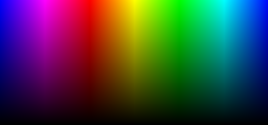
Gradient representing all colors and shades in our colorspace.
To compare using Desaturate: Original - Lightness - Average - Luminosity
So let's have a look.
The rest of my GIMP tutorials can be found here:
Getting Around in GIMP
The rest of the tutorials in this series are here:
B&W Conversion - Part 1 (Desaturate)
B&W Conversion - Part 3 (Decompose)
B&W Conversion - Part 4 (Pseudogrey/c2g/Layers)
B&W Conversion - Part 5 (Putting it All Together)
Getting Around in GIMP
The rest of the tutorials in this series are here:
B&W Conversion - Part 1 (Desaturate)
B&W Conversion - Part 3 (Decompose)
B&W Conversion - Part 4 (Pseudogrey/c2g/Layers)
B&W Conversion - Part 5 (Putting it All Together)
We saw how the Desaturate command can use straight numerical evaluations for conversion (Lightness and Average) as well as using the relative luminosity model for how our eyes will perceive brightness based on color.
These are fantastic and easy to use conversion options that require no extra work on your part to get to a grayscale image. Almost every other option from here on out will require you to make choices and adjustments to get your results.
This time around we are going to have a look at another very widely used method for converting to grayscale, the Channel Mixer.
Channel Mixer
Using Desaturate let you convert to grayscale based on pre-defined functions for calculating the final value, but what if you wanted even further control? What if you wanted to decide just how much the red channel should influence the final gray value, or to have more control over the ratios and weightings of each of the different channels independently? That is precisely what the Channel Mixer will allow you to do.For the examples below, I'm going to mix it up with a different color gradient test map, blue to blue HSV gradient, with a gradient to black vertically. This represents our entire colorspace (feel free to download this image to follow along).


Gradient representing all colors and shades in our colorspace.
To compare using Desaturate: Original - Lightness - Average - Luminosity
So let's have a look.
Getting Around in GIMP - Black and White Conversion (Part 1)
This is a long topic, so to keep you from wanting to put your eyes out with a spoon, I've tried to break things up a bit. In this first part, I'll look at using the GIMP Desaturate command to reduce your images to grayscale and to hopefully shed some light on just how the options calculate exactly what level of gray each pixel should be.
What you want to keep in mind is that by removing the color information you have effectively left yourself with only tonal data (and composition) to convey your intentions.
This can be both liberating, and confining.
By liberating yourself of color data, you can focus much more clearly on the subjects and composition with whats left. (Indeed, this is often felt to be one of the primary reasons street photography is normally associated with B&W images - with no colors to distract you, the focus is on the subjects and composition even more).
Globally, it may refer to the overall distribution of lights and darks. Locally the same definition applies, but applied across a smaller section of the image.
Then with the image containing as much tonal detail as possible, I will approach it with adjustments of various types to produce a final result that pleases my eye.
Before we can head down that road, we have to step back and consider the tools we are using. So...
Let's have a look at how an image gets displayed on your monitor!
The rest of my GIMP tutorials can be found here:
Getting Around in GIMP
The rest of the tutorials in this series are here:
B&W Conversion - Part 2 (Channel Mixer)
B&W Conversion - Part 3 (Decompose)
B&W Conversion - Part 4 (Pseudogrey/c2g/Layers)
B&W Conversion - Part 5 (Putting it All Together)
Getting Around in GIMP
The rest of the tutorials in this series are here:
B&W Conversion - Part 2 (Channel Mixer)
B&W Conversion - Part 3 (Decompose)
B&W Conversion - Part 4 (Pseudogrey/c2g/Layers)
B&W Conversion - Part 5 (Putting it All Together)
What We're Trying to Achieve
B&W photography deserves a much longer look than I can afford to bore you with here. However, there are a few things I would like to focus on in regards to preparing your images for B&W.
What you want to keep in mind is that by removing the color information you have effectively left yourself with only tonal data (and composition) to convey your intentions.
This can be both liberating, and confining.
By liberating yourself of color data, you can focus much more clearly on the subjects and composition with whats left. (Indeed, this is often felt to be one of the primary reasons street photography is normally associated with B&W images - with no colors to distract you, the focus is on the subjects and composition even more).

Tonality
What I tend to refer to when using this term is the presence and relationships between different values of gray in the image. This can be subtle, with smooth, even differences among values, or much more pronounced.Contrast
Contrast is the relative different in brightness between parts of an image. High contrast will have a much sharper differentiation between lighter and darker portions of an image, while low contrast will show less differences. Often a straight conversion to B&W can result in gray values that are all very similar, yielding a visually "flat" image.Globally, it may refer to the overall distribution of lights and darks. Locally the same definition applies, but applied across a smaller section of the image.
Dynamic Range
Dynamic range is just the overall range of values being captured in your image. It represents the maximum dark and light that is captured for a given exposure. (Extending this dynamic range in an image is the topic for a later tutorial).The Approach
The approach I will take here follows similar approaches I had taken in film days. I'll attempt to use different methods of grayscale conversion (and blending them) to get to a working image that is as full of tonal detail overall as possible. (Petteri Sulonen refers to this as his "digital negative") - if you want a great look at a digital B&W workflow, head over and read his article.Then with the image containing as much tonal detail as possible, I will approach it with adjustments of various types to produce a final result that pleases my eye.
Before we can head down that road, we have to step back and consider the tools we are using. So...
Let's have a look at how an image gets displayed on your monitor!
GIMP Editing Challenge Results
At the beginning of this month I posted a RAW image of a house that I asked people to process in GIMP to turn it into a black and white image, and to describe their workflows in doing so.
My hope was to be able to expose some new and interesting ways to approach black and white processing in GIMP, and to give everyone a single point of reference to compare the results to.
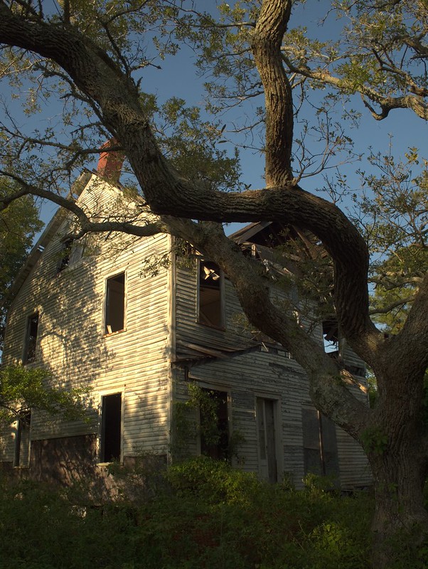 The challenge base image
I had originally envisioned it as a sort of contest where everyone could vote on their favorites at the end, but it became cumbersome to maintain entries across Flickr and gimpchat.com. So instead I've left the posts as they are to hopefully help others to get a look into some cool ways to approach B&W conversions.
I was thinking that this might be a good image to test against because there is bright, just about blown, sunlight on the side of the house, while there are also very dark shadows in some of the windows and bushes. Hopefully a nicely challenging range of luminance and detail to work with!
There were some great responses from everyone who took a stab at it (pun intended - it is Halloween here!). I just wanted to take a moment to highlight a few of the images/processes that I liked personally...
My hope was to be able to expose some new and interesting ways to approach black and white processing in GIMP, and to give everyone a single point of reference to compare the results to.
The challenge base imageI had originally envisioned it as a sort of contest where everyone could vote on their favorites at the end, but it became cumbersome to maintain entries across Flickr and gimpchat.com. So instead I've left the posts as they are to hopefully help others to get a look into some cool ways to approach B&W conversions.
I was thinking that this might be a good image to test against because there is bright, just about blown, sunlight on the side of the house, while there are also very dark shadows in some of the windows and bushes. Hopefully a nicely challenging range of luminance and detail to work with!
There were some great responses from everyone who took a stab at it (pun intended - it is Halloween here!). I just wanted to take a moment to highlight a few of the images/processes that I liked personally...
Getting Around in GIMP - Polaroid 600 Film Border Script

A while back I had written up a post and some Script-Fu for GIMP to emulate the colors I was seeing from very expired Polaroid 600 Instant film. That older post is here:
Getting Around in GIMP - Expired Polaroid 600 Film Effect
I basically loved the nasty color cast and funky things that part of the image did where the developer had dried up in the packets, and there wasn't enough left to fully cover and develop the entire image area. If you head on over to that post, you'll find what I did as well as color curves and some other Script-Fu to automatically apply those colors and degradations to your images. It's also located at the GIMP Plugin Registry right here.
As part of creating that script, I also wanted to create a more realistic looking border script that would emulate the embossed patterns found on the original 600 Polaroid film.
Visualize Photography Lighting Setups in Blender

The most patient portrait model in the world...
Not too long ago I finally got around to picking up a decent manual flash for exploring lighting and speedlight techniques. I picked up a Yongnuo YN-560 Speedlight Flash for Canon and Nikon
I say mostly because though I had a rough understanding of how I wanted to use the light, I was not well versed on what could be done with it. So I spent a bit of time on the Flickr Strobist Group, and read through all of the Lighting courses on the Strobist site. There is an absolute wealth of information on the site, and I cannot recommend it enough.
Having a reference for how the contribution of different types of light will affect the final outcome is very handy for me. I've seen people who have taken the time to setup lighting diagrams where they will modify a given light for direction/angle, and cycle through many possibilities to help as a reference (Here is one cheat-sheet from DIY Photography).

This is nice, but what if I wanted to visualize the effect multiple lights will have all simultaneously? I guess I could go and shoot every, possible, variation, but I am really lazy. Plus, I don't have access to a model with the patience to sit there while I fiddle with multiple lights, multiple times.
It occurred to me that I already had a great tool for doing this visualization already installed on my computer. That tool is Blender 3D. I already had been using this open source 3D modelling tool for some time, and was familiar enough with it to be comfortable emulating my lighting setups. All I needed was a good model.
Getting Around in GIMP - Skin Retouching (Wavelet Decompose)


I have looked around quite a bit for a good method in GIMP to smooth skin for portrait work. I did find a few tutorials, but they all were mainly concerned with using Gaussian blur with a layer mask to "smooth" the skin. The results were almost always less than satisfactory.
The rest of my GIMP tutorials are all listed here: Getting Around in GIMP
For more examples of this technique at work, have a look at:
my recent shoot with Mairi!
Want to see Wavelet scales as part of a complete portrait retouching workflow? Check here:
The Open Source Portrait (Postprocessing)
For more examples of this technique at work, have a look at:
my recent shoot with Mairi!
Want to see Wavelet scales as part of a complete portrait retouching workflow? Check here:
The Open Source Portrait (Postprocessing)
Then I found the Wavelet Decompose plugin, and the search was mostly over for me.


I thought it might be helpful to walk through the theory as I approach it for skin retouching/smoothing, and how Wavelet Decompose fits into my workflow.
Getting Around in GIMP - Contour Painting
Similar to using dodging and burning is something I like to call "Contour Painting". It's basically dodging and burning (d&b), but with an eye towards contours of the subject in a photo. I will use this very often in shots with skin, and a great example of this would be a nice cheesecake pin-up style image!

Lovely pin-up pose! (mouseover to see the final result)
First off, I want to thank Evolutions Photography for graciously allowing me to use this wonderful image as part of my tutorial. The model is the lovely Ariel Fulmer (Arielita on ModelMayhem). Make up artist is DmarieBelleza, and the hair stylist is Anna Marie De Almeida. I originally came across this image in the ModelMayhem Digital Art & Retouching Challenge forum in this thread.
The rest of my GIMP tutorials are all listed here: Getting Around in GIMP
If you want to retouch the skin before contour painting, see this tutorial:
Skin Retouching (Wavelet Decompose)
If you want to retouch the skin before contour painting, see this tutorial:
Skin Retouching (Wavelet Decompose)
Getting Around in GIMP - Luminosity Masks
The rest of my GIMP tutorials are all listed here: Getting Around in GIMP
There was a recent thread on the GIMP users forum at Flickr on how to generate luminosity masks (and use them I suppose). I figured I would chime in a bit here with how I generate and use them in my own workflow. There is an older and interesting discussion about Luminosity Masks by Tony Kuyper that was referenced in that thread, and this is a translation of sorts for GIMP users that want to accomplish the same thing. The original tutorial by Tony is here: Tony Kuyper's Luminosity Masks Tutorial
The basic premise of luminosity masks is to allow you to modify elements of a layer masked to a specific region of luminosity (or value). If I wanted to control the colors in the shadows of my image without modifying the mid tones or light tones, then this is the method you want. Similarly you can adjust just the mid tones, or light tones without affecting the other regions as well.
If you are new to layer masks (or need to brush up), I recommend you head to Getting Around in GIMP - Layer Masks to brush up first, then come back.
Some Theory
What we'd like to accomplish is to produce masks for our image that target a specific tonal range (lights, mids, or darks). This way, we can make adjustments to the image on a layer, and to use the masks to only apply those changes to certain areas (based on luminosity or value). The nice thing about using our image as the base for the mask is that the tonal ranges in the image will provide a smooth transition between the different layer masks.
Even though you may want to modify some aspect of the lighter portions of your image, it will be hard to tell where that effect is applied as it fades to a gray or black. Don't worry if this sounds strange, it will become clear before long...
To illustrate what we want, I am going to create a simple image with a gradient that goes from full white to full black:

Lights Mask
Now, across this gradient we may want to make modifications, but restrict them to the lighter values. This is usually the simplest mask to create, and just involves making a desaturated copy of your base image (based on Luminosity). So, create a copy of your base layer, and run:
Colors → Desaturate
and check the box for Luminosity.
After doing this, my gradient image will look exactly the same. I'll normally rename this layer to something original and creative, like Lights. That's actually all there is to it! Let's see it in action, though, to find out how this helps us.
I'm going to create a new layer in my image filled with red, and I am going to turn the visibility off on the other layers. So now my image looks like this:

At this point I will add a layer mask to my red layer by Right-Clicking on the red layer, and choosing Add Layer Mask.... I'll usually just initialize the mask to White (full opacity), because I'll be changing it shortly anyway.
Then I will want to copy my Lights layer by activating it (Left-Click on the layer), and then choosing:
Edit → Copy.
Now just paste this into the layer mask on the red layer by activating (Left-Clicking) the red layer mask, then doing:
Edit → Paste.
This will give you a Floating Selection (Pasted Layer) on your layer window, and you can just Right-Click the Floating Selection layer, and choosing Anchor Layer. This will now paste your Lights layer as a layer mask, and you should now see this:

My Layers palette now looks like this:

Basically, we can now change whatever we want on the red layer, and it will only affect the lighter parts of that layer.
Darks Mask
We can produce another mask that will only affect the darker parts of our image by simply inverting the Lights layer. First I'll duplicate the Lights layer, then invert the colors on that layer:
Colors → Invert
To keep things straight in my head, I'll find an even more original and interesting name to rename this layer, like Darks.
To show the two masks being applied to my image, I'll create another new layer below the red layer, and fill it with a nice blue, then add a layer mask, and copy-paste the Darks layer into the layer mask the same way as above.
This results in:

My layers palette for this image:

The reason that they are not perfectly blended exactly in the middle of the gradient is due to the layer ordering on my palette (red above blue). What we are seeing here is that the Lights and Darks layer masks only allow the portions of their layer to show through according to the mask (red shows through the Lights mask, and blue shows through on the Dark mask).
Mids Mask
There is one more mask we can make from these Light and Dark masks, and that is a mask for the Mid tones. This is simply the difference between the Light and Dark masks, inverted:

Lights Mask

Darks Mask

Mids Mask - Difference between Lights and Darks, inverted.
To create this mask easily, just make visible your Lights and Darks layer, then set the one on top (Darks in my example) to layer mode: Difference.
Right-Click on the top layer, and choose New from Visible. Then, invert the colors on the new layer (and name it something interesting... say... Mids).

Darks layer set to Difference mode, then created a new layer from visible, and inverted the new layer colors to get the Mids Mask.
If we now take our image strip one step further and add a green filled layer, and apply the Mids mask to it, we have this:

Solid Red, Green, and Blue layers with all masks applied.
The layers palette:

There is one other thing that bears mentioning here, and that is the range that each mask allows through. The Lights mask you will notice went from pure white, all the way to black, with many shades of gray in between. If you wanted one of your masks to not affect other tones as much, you can simply adjust the mask levels to remove other shades.
For instance, the red layer above the blue layer in the example above showed red extending past the mid tones and into the darker tones. You could clamp each mask to only affect from mid tones to either Light or Dark by adjusting each layer masks levels. You would basically activate a mask, then go to
Colors → Levels...
And set the Input Levels Black Point to 128 (middle gray). This will make the Lights mask stop affecting anything right at the middle gray point.

If you do the same thing to the Darks mask, then each mask will stop affecting anything right at the mid-point of values (they won't bleed over into each other). If I do this, and hide the green layer, we'll see:

Lights and Darks mask clamped at the mid point to prevent spill-over.
Layers palette:

The main thing to take away from this is that you can create these masks, and then narrow the range of tonal values they apply to by adjusting their range (using Levels). This can then let you filter out specific tonal ranges in your image to modify, independent of other areas.
A good example to see this in action would be to try some... Split Toning!
Split Toning
In my opinion, this is probably the easiest way to ease into how Luminosity Masks should work. The basic premise behind split toning is that you want to color a black and white image using two different colors: one color for the darks, and another color for the lights. In my example below, we'll use this image from the Dauphin Street Beer Festival in Mobile, AL.:

You can download this image from my Flickr photostream if you'd like.
Now, we need to make some artistic judgements with how we want to split-tone this image. In honor of teal & orange madness, we will use a teal color to tint the dark areas of the image, and a nice orange for the lights.
With our newfound knowledge of how luminosity masks work, this should be a piece of cake, right?
Let's create those masks...
- So load up your image, and duplicate the Background layer.
- Desaturate it using Luminosity. This is now your base Lights layer (might want to rename it for clarity).
- Duplicate this new Lights layer, and do Colors → Invert to invert it. This is your base Darks layer. Rename it to Darks
- This step is optional, but if you wanted to clamp the Lights and Darks layers to not overlap, on each layer of the two layers do a Colors → Levels, and set the black points to 128 (see above).

Now you have your Lights and Darks masks. The next step would be to add some color to your image. How you go about this is entirely up to you, but I will walk through a simple example.
- Turn off all layers except your Background layer.
- Copy your Background layer twice (we'll use one for the cool dark tones, and the other for warm light tones). Name them something descriptive (I'm going to use "Warm" and "Cool").
- Now we need to tint each layer with the appropriate color. We'll start with the cool layer. You can tint this layer using any method you'd like, but for the purposes of this tutorial I'll use Colors → Colorize....
- Your Cool layer should have a nice blue-ish tint to it right away (if you can't see it, you may have to hide any layers above it). Let's get it more teal-like by changing the Hue to about 200 in the Colorize the Image dialog:
- Nice, but the entire image is now tinted teal. This is where we can apply the Darks layer mask to restrict the teal tint to the darker tones in the image only.
- Add a layer mask to the Cool layer (Right-Click the layer, and choose Add Layer Mask... - you can initialize it to white, we're going to replace it in a moment.)
- Select your Darks layer, and copy it (Edit → Copy).
- Now select the Cool layer mask, and paste in the Darks layer you just copied. Right-Click the new Floating Selection (Pasted Layer) and Anchor Layer to apply it. Your image should now change, and you'll notice that the teal tint is only applied to the darker tones in your image. Halfway there!
- Now on to the Warm layer! Select it, and again run Color → Colorize...
- This time we want to use a warmer color for the light tones, so set the Hue to around 20. Your layer should have a nice orange-y tone to it.
- Apply the Lights layer mask to the Warm layer. Right-Click the Warm layer, and choose Add Layer Mask..., again initializing to white is fine.
- Select your Lights layer, and copy it (Edit → Copy).
- Select the Warm layer mask, and paste in the Lights layer you just copied. Anchor the Floating Selection to apply it.


That's it! You should now notice that all the darker tones in your image have a cooler teal color to them, while the highlights will have a warm orange color. The separation of tones is all due to the Lights and Darks layer masks that you've applied:
Mouse over the image to see the original.
You could also go a step further here if you'd like and generate a Mid-tones mask as well for further experimentation! I know this has been long, but hopefully it's been helpful. I will write another post addressing how to further narrow the range of tones in your masks to specifically target even smaller sections of the image.
Feel free to ask any questions in the comments.
Help support the site! Or don’t!
I’m not supporting my (growing) family or anything from this website. Seriously.There is only one reason I am writing these tutorials and posts:
I love doing it.
Technically there is a second reason: to give back to the community. Others before me were instrumental in helping me learn things when I first got started, and I’m hoping to pay it forward here.If you want to visit an ad, or make a donation, or even link/share my content, I would be absolutely grateful (and tickled pink). If you don’t it’s not going to affect me writing and posting here one bit.
I’ll keep writing, and I’ll keep it free.
If you get any use out of this site, I only ask that you do one thing:
pay it forward.
Getting Around in GIMP - Layer Masks
An occasional question comes up concerning the use of Layer Masks for really controlling your edits to an image, and I thought I would approach the basics in this post. This is really a primer before moving into a much cooler topic - Luminosity Masks for controlling tonal ranges in a different way. (The Luminosity Masks tutorial is finished and can be found here!)
On a side note, this is also a method many people use for selective coloring an image. They will generate a desaturated version of their image, then lay a color version over it with a layer mask. You could then use the layer mask to only allow the color version to show where you painted it. (I am not a fan of selective coloring personally, but I'm not writing this post for me...)
First up is an understanding of how masks work in the first place.
Fundamentally, layer masks allow you to block out parts of the current layer that you want to show through. That's pretty much it. In GIMP, a white layer mask means that everything on that layer is visible. Any black in the layer mask will make that portion of your layer completely transparent, and will allow whatever is below to show through.
The power of layer masks is that the transparency of your layer can be controlled by any shade of gray. If you paint on a layer mask with 50% gray, then that portion of your layer will be 50% transparent (and it all scales linearly). Layer masks are purely grayscale affairs, so you can only work in shades of gray.
A quick example should illustrate things nicely here:

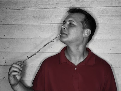
Believe it or not, he was sober when he posed for this...Meet my friend Steven. (Shot as a test of my DIY ringflash during a party). Below the layer of Steven I have put another layer filled with orange. I've added a Layer Mask on the layer of Steven, and painted three sections on the Layer Mask (from top to bottom): White, 50% Gray, and Black:

And this is what it looks like as applied to the layer of Steven (remember, the orange layer is below the Steven layer):

And this is what my Layers window looks like at this point:

So as we can see, as the layer mask colors approach black, it makes the current layer more transparent to show what is below it.
I recommend you try this yourself to see what I mean. To add a layer mask to a layer, just Right-Click on the layer, and choose Add Layer Mask...
If you're just experimenting, you can just choose
Initialize Layer Mask to: White
to get started, this will make your entire layer opaque - then paint on black to choose what is transparent (or some other level of gray to control the amount of transparency).
Remember, the currently active layer (or mask) that you are operating on will have a white border in your Layers window (to select a different layer or mask to operate on, just Left Click on it).
To begin to see the power of using layer masks, we'll go through a simple example of Selective Coloring. Perhaps we'd like to have a black and white image of Steven, but only let his garishly red shirt color show...
In that case I would take my base image of Steven, and duplicate the layer of his image (Background in my case). You can duplicate a layer by Right-Clicking on it and choosing Duplicate Layer.
This will give you a new layer called Background copy. Now you can activate that layer by Left-Clicking on it, then turn it to black and white by choosing
Colors → Desaturate...
from the menus.
You can choose any method to choose the shade of gray (I'm partial to Luminosity most of the time). Then Right-Click on the Background copy layer and choose Add Layer Mask.... I chose to add a White layer mask for full opacity (meaning the layer is completely opaque).
After following these steps you should see your layers looking like this:

Color layer below, B&W layer on top with a white layer mask.
Now we are ready to bring out his shirt! Activate the layer mask by Left-Clicking on it, and choose a nice foreground color to paint with. Because we want his entire red shirt to show through, we'll choose black for maximum transparency. We basically want to paint in the area where his shirt is with black to make it transparent on this layer, and to allow the layer below to show through (the color layer).
I'm going to use a Paintbrush Tool with a big fuzzy circle to paint over his shirt with.
As you paint you should see that everywhere you paint the red shirt from the layer below comes popping through! After a quick painting session I've ended up with something like this:

The mask I painted looks like this:

Remember, I didn't have to use black as my painting color - if I had used a light gray, I would have let some of the color through, but not as much (leading to a more muted effect). Here is what the same thing looks like, but painted with a light gray instead of black:
The corresponding layer mask now looks like this:

Hopefully this has been a reasonable introduction to layer masks. That's really all there is to how they work. The power comes from manipulating the mask using other tools and approaches to really gain some amazing control over your image. In particular my next post will focus on creating and using luminosity masks to really control the tonal ranges in your images in a new way!
If you're ready for it, then head over to the next tutorial on how to start using these masks at Getting Around in GIMP - Luminosity Masks!
On a side note, this is also a method many people use for selective coloring an image. They will generate a desaturated version of their image, then lay a color version over it with a layer mask. You could then use the layer mask to only allow the color version to show where you painted it. (I am not a fan of selective coloring personally, but I'm not writing this post for me...)
The rest of my GIMP tutorials are all listed here: Getting Around in GIMP
Understanding Masks
First up is an understanding of how masks work in the first place.
Fundamentally, layer masks allow you to block out parts of the current layer that you want to show through. That's pretty much it. In GIMP, a white layer mask means that everything on that layer is visible. Any black in the layer mask will make that portion of your layer completely transparent, and will allow whatever is below to show through.
The power of layer masks is that the transparency of your layer can be controlled by any shade of gray. If you paint on a layer mask with 50% gray, then that portion of your layer will be 50% transparent (and it all scales linearly). Layer masks are purely grayscale affairs, so you can only work in shades of gray.
A quick example should illustrate things nicely here:

Believe it or not, he was sober when he posed for this...

And this is what it looks like as applied to the layer of Steven (remember, the orange layer is below the Steven layer):

And this is what my Layers window looks like at this point:

So as we can see, as the layer mask colors approach black, it makes the current layer more transparent to show what is below it.
I recommend you try this yourself to see what I mean. To add a layer mask to a layer, just Right-Click on the layer, and choose Add Layer Mask...
If you're just experimenting, you can just choose
Initialize Layer Mask to: White
to get started, this will make your entire layer opaque - then paint on black to choose what is transparent (or some other level of gray to control the amount of transparency).
Remember, the currently active layer (or mask) that you are operating on will have a white border in your Layers window (to select a different layer or mask to operate on, just Left Click on it).
Masks Example: Selective Coloring
To begin to see the power of using layer masks, we'll go through a simple example of Selective Coloring. Perhaps we'd like to have a black and white image of Steven, but only let his garishly red shirt color show...
In that case I would take my base image of Steven, and duplicate the layer of his image (Background in my case). You can duplicate a layer by Right-Clicking on it and choosing Duplicate Layer.
This will give you a new layer called Background copy. Now you can activate that layer by Left-Clicking on it, then turn it to black and white by choosing
Colors → Desaturate...
from the menus.
You can choose any method to choose the shade of gray (I'm partial to Luminosity most of the time). Then Right-Click on the Background copy layer and choose Add Layer Mask.... I chose to add a White layer mask for full opacity (meaning the layer is completely opaque).
After following these steps you should see your layers looking like this:

Color layer below, B&W layer on top with a white layer mask.
Now we are ready to bring out his shirt! Activate the layer mask by Left-Clicking on it, and choose a nice foreground color to paint with. Because we want his entire red shirt to show through, we'll choose black for maximum transparency. We basically want to paint in the area where his shirt is with black to make it transparent on this layer, and to allow the layer below to show through (the color layer).
I'm going to use a Paintbrush Tool with a big fuzzy circle to paint over his shirt with.
As you paint you should see that everywhere you paint the red shirt from the layer below comes popping through! After a quick painting session I've ended up with something like this:

The mask I painted looks like this:

Remember, I didn't have to use black as my painting color - if I had used a light gray, I would have let some of the color through, but not as much (leading to a more muted effect). Here is what the same thing looks like, but painted with a light gray instead of black:

The corresponding layer mask now looks like this:

Hopefully this has been a reasonable introduction to layer masks. That's really all there is to how they work. The power comes from manipulating the mask using other tools and approaches to really gain some amazing control over your image. In particular my next post will focus on creating and using luminosity masks to really control the tonal ranges in your images in a new way!
If you're ready for it, then head over to the next tutorial on how to start using these masks at Getting Around in GIMP - Luminosity Masks!
Subscribe to:
Posts (Atom)