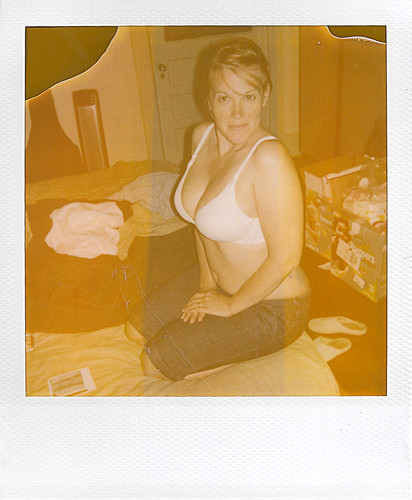
I found an old Polaroid camera among a pile of old stuff in my house recently, and lo and behold it still had film in it! The camera had 7 shots left, and my wife and I had fun shooting the last few that evening. What was wonderful was that the developer/fix in the film had started to dry out (the film expired 5 years ago), and it left some wonderful un-developed portions of the final print where there was not enough chemicals to completely cover the image. The colors were also quite washed out and interesting.
Click here for my gallery on
Flickr that shows some expired Polaroids to get an idea of the effect I am referring to.
So I have decided to attempt a replication of the effect in GIMP (mostly as a means to learn script-fu a little better). I have broken down the attempt at recreation into two parts:
Replicate the colors of the washed-out image, and the undeveloped portions of the print.
Replicate the border of the Polaroid 600 film to frame the image with, including the texture.
Replicating Colors
This wasn't as bad as I thought it would be. There are a couple of ways you could go about this...
One way is to open up a scan of an expired shot, and color correct it in GIMP until the colors look pretty good and natural to you. Then you will only need to find the RGB differences of some representative pixels to create your curve. I'll have a tutorial up later about how I approach that (tedious...).
Another way is to just go ahead and use the
awesome Get Curves Plugin from
elsamuko on
GIMP registry. (By the way, I highly recommend checking out his
other GIMP scripts/plugins as well!)
To use the script, you only need two layers in your image - the original, and the one you color-corrected to look more "normal". The original image should be above the "normal" one in your layer list. When you run the plug-in, it will generate a new GIMP curve file (called curve_SOME-DATE). The great thing about this plugin is that it checks pixel-by-pixel the color difference between the two layers, and creates the new curve from that data.
This curve now represents the color difference between your "normal" layer, and the original. You can now apply this curve back to the "normal" layer and the result should be
really close to the original.
To help speed things along for anyone interested, I have already created the presets for my expired film:
Expired Polaroid 600 Curve Preset (the center strip)
Expired Polaroid 600 Run Curve Preset (the outer strips)
Save these files in your
Curves folder for your GIMP install (locations vary, but you can check by going to
Edit → Preferences and checking under
Folders - it's usually around the same location as your brushes folder for instance).
Let's apply these curves to a new image to see the effect...
This is another image of my lovely model. I cropped the image to roughly match a Polaroid 600 image area (roughly 1:1.03 aspect ratio - the height is approximately 1.03 times the width).
Here the color curves linked above have been applied. I basically duplicated the base image twice, and applied each of the two color curves above to each duplicate. Then I used a layer mask to mask out the strip in the middle of different colors (allowing the layer below to show through). I still haven't added any grain or degraded pixel quality, but it seems fairly close!
If you've followed me this far - congratulations! As a bonus, I've already written the script-fu to automatically apply this to an image. It can be found at registry.gimp.org:
Download Expired Polaroid 600 Print Emulation script-fu
This script will also apply the un-developed corners that appear on expired film (usually because the developer has begun to dry up in the packets, and there is not enough to fully cover the frame anymore). To make things even more polaroid-y I have also removed any control over how big or where the undeveloped portions will occur. Just like real expired Polaroids! :)
Here's an example of the script in action (it doesn't create the border for you automatically - yet):


[Update]
There's a neat video
here that shows how the Impossible Project is still cranking out instant film in the Netherlands.
[/Update]


