I think this was mostly due to reading the great Zack Arias “White Seamless Tutorial”, and trolling around on The Strobist again. I also just got my camera back, so it was as good a time as any to put it through some paces… (Plus, I needed the practice).
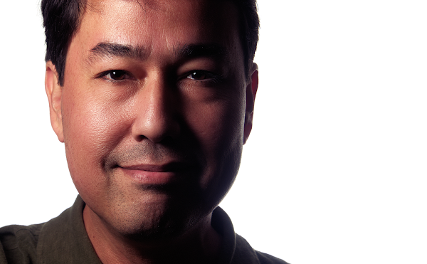
So first, here is the final result after all of my fiddling:
So my first desire in shooting this was to play with getting the background blown to pure white. I happened to have a whiteboard in my office conference room that I figured would be a good background to start with.
I setup one Yongnuo YN-560 II
Because I apparently lack the drive to buy proper equipment, I didn't have a light stand handy to hold my key light. I also didn't have my larger softbox handy to use for this. I did have a smaller 6” × 8” Softbox
If you need a video instead of an animated gif, here it is (and how does YouTube not know how to handle a 960×540 resolution properly?):
So what I had was, one YN560 at just over ½ power firing into the whiteboard behind me, and a second YN560 in the small softbox, handheld, at just under ½ power. After cropping, this is the image straight out of the camera (well, the RAW after RawTherapee with some leveling):
I notice right away that I’m over-driving my background. I wanted to get a little wrap on the dark side of the face, but instead have the background leeching onto me a bit too much (the slight flare shows this too well). At least the background is white, though, right? :)
You’d think if I was going to bother reading a tutorial, that I’d at least pay attention to what it said, right? It’s funny because Zack specifically shows a case of the BG being overexposed. The flare and loss of contrast on the subject is an effect of this.
The softbox was just a bit too small for my taste. One this small is really only useful up super-close to the subject, I think. Otherwise it’s a bit too hard for me.
Still, I don’t think the image is a loss (but I’ll definitely spend a few extra minutes dialing in the ratio between subject and background next time). I purposefully kept the shadows a little brighter from my RAW conversion, and would push them down a bit in GIMP.
Into GIMP I just moved along with my normal workflow. Wavelet Decompose where I stayed mostly on residual with a touch of the largest scale. Mostly just to smooth out my skin tones a little. Some slight dodging and burning to bring some volume back, levels to push the blacks down and to increase the contrast a little more. Finally, Petteri Sulonen’s Portra-esque color curve to finish it off.
Here’s the final result again (mouseover to compare to the original):
Two other things that I think are worth mentioning. I couldn’t help but try Peter Hurley’s advice to bring the head forward to help accentuate the jawline (and hopefully remove unsightly turkey-neck), but even more interesting was the slight squinting of the eyes. Not like I forgot my glasses, but more of squinting with the lower lids of my eyes.
I have really bad bags under my eyes that are a permanent fixture of my face, and slightly squinting with my lower lids really helped alleviate some of that apparent bagginess. I didn’t retouch those bags at all, which was nice.
The other thing is the crop, in case anyone was wondering:
Thirds are for chumps.
Not really, but figured if I was going to play with the crop, might as well have some fun with a Fibonacci sequence, right? Why not!


Honestly, the skin retouching looks better than anything I've ever done in Lightroom. I'm going to need to read up on using Wavelet Denoise to improve how I handle that. I also really like your decision to increase the shadows, rather than reduce. It's a lot more light ratio than I'm used to using, but it really works here. I'm looking at doing a creative self portrait at some point in the near future, so I'm keeping all this in mind.
ReplyDeleteOnce again, thanks for an outstanding post that warrants a thorough study.
Thanks Rick!
DeleteI'm glad that it's been helpful in some way (seriously, sometimes I just put this stuff out there and have little feedback to know - so I operate in a vacuum sometimes.. :) ).
Actually I think you did to much on the lower decomposed layers (bigger structures). Especially around the eyes it looks very strange to me.
ReplyDeleteI though this was good and enjoyed it. Although I know some about lighting I still learn something new every-tine I read something like this. Thank you
ReplyDelete