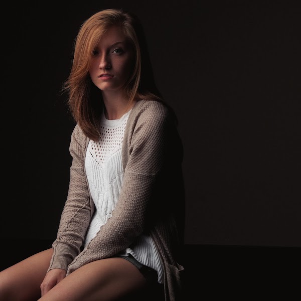
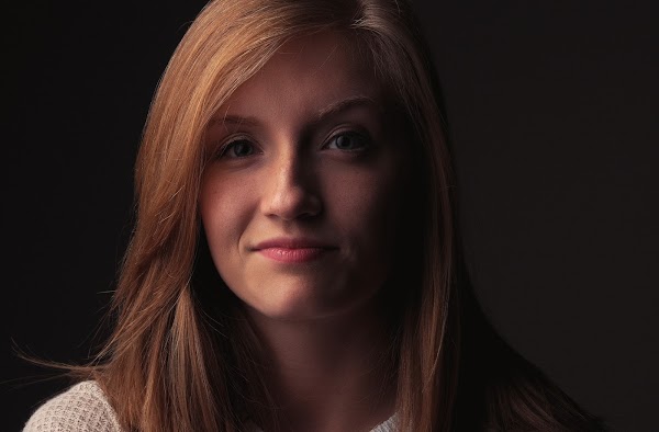
Sarah has been shooting with my friend Brian for a while now. He and I recently tried to organize to shoot together, but unfortunately he was called away at the last moment. Which was a bummer, because I had also just purchased a 60” Photek Softlighter II
Luckily Sarah was still good to do the shoot! (There were some initial hiccups, but we were able to sort them out and finally get started).
There were two aspects to obtaining these results I thought it might be nice to talk about briefly here, the lighting and the post work...
The Lighting
If you’ve ever followed my photographs, I like to keep things simple. This is mostly for two reasons: 1) I’m cheap, and simple is inexpensive. 2) I’m not smart, and simple is easy to understand.
Well, I also happen to really like the look of simply lit images if possible. Some folks can get a little nuts about lighting.
The real creativity is when you can make a simply lit image look good . This is the hard part, I think, and the thing I spend most of my time working to achieve and learn about.
I had previously built myself a small-ish softbox to control my light a bit more, and it has seen quite a bit of use in the time that I’ve had it. It works in a pinch for a neat headshot key light, but I was bumping into the limits of using it due to size. I was mostly constrained with tight-in headshots to keep the light relatively soft. (It was only about 20" square).
So I had been looking for quite some time at a larger modifier. Something I could use for full body images if I wanted, but still keep the nice control and diffusion of a large softbox. Thanks to David Hobby, I finally decided that I simply had to have the Photek Softlighter.
To help me understand faster/better what the light is doing and how it effects a photograph, I try to minimize the other variables as much as I can. Shooting in a controlled environment allows me this luxury, so all these images I took of Sarah are shot with a single light only. This way I can better understand it’s contribution to the image if I want to add any other modifiers or lights (without having to worry about nuking the ambient at the same time).
Plus, chiaroscuro!
Postprocessing
For these images I wanted to try something a little different for a change. I wanted to have a consistent color grading for all the images from the session, and I wanted to shoot for something a bit softer and subdued.
I followed my usual workflow (documented here and here).
Here was the original image straight out of the camera:
In my Raw processor, I adjusted exposure to taste, increased blacks just slightly and added a touch of contrast. I also dropped the vibrance of the image down just a bit as well. I did this because I knew later I would be toning with some curves and didn’t want things to get too saturated.
I brought the image into GIMP at this point for further pixel-pushing and retouching. As usual, I immediately decomposed the image into wavelet scales so I could work on individual frequencies. There wasn’t much needed to be done for skin work, just some (very) slight mid-frequency smoothing. Spot healing here and there for trivial things, and I was done.
One small difference in my workflow is that I’ve switched from using a Gaussian Blur on the frequency layers to using a Bilateral Blur instead. I feel it preserves tonal changes much better. It can be found in G'MIC under Repair → Smooth [bilateral].
At this point, it was color toning time! (alliteration alert!)
I ended up applying a portra-esque color curve against the image, and reduced its opacity to about 50%. This gave me the nice tones from the curve adjustment, but didn’t throw everything too far red. Just a sort of delicate touch of portra...
At this point I did something I don’t normally do that often. I wanted to soften the colors a bit more, and skew the overall feeling just slightly warmer and earthy-toned. Sarah has very pretty auburn hair, the portra adjusted the skin tones to be pleasing, and she had on a white shirt, with a gray/brown sweater.
So I added a layer over the entire image and filled it with a nice brown/orange shade. If you’re familiar at all with teal/orange hell, the shade is actually a much darker and unsaturated orange, but we’re not going to cool the shadows separately. We’re just going to wash the image slightly with this brown-ish shade.
This is the shade I used.
It’s #76645B in HTML notation.
It’s #76645B in HTML notation.
I set the layer opacity for this brown layer down really low to about 9%. This took the edge just ever so slightly off the highlights, and lifted the blacks a tiny bit. Here’s the final result before cropping:
I feel like it softens the contrast a bit visually, and enhances the browns and reds nicely. After sharpening and cropping I got the final result:
I purposefully didn’t go into too much detail because I’ve written at length about each of the steps that went into this. The most important thing I think in this case is finding a good color toning that you like (the post about color curves for skin is here). The color layer over the image is new, but it was honestly done through experimentation and taste. Try laying different shades at really low opacity over your image to see how it changes things! Experiment!
The rest of my GIMP tutorials can be found here:
Getting Around in GIMP
Getting Around in GIMP
More Sarah
Now that we’ve had a chance to shoot together, I’m hoping we can continue to do so. In the meantime, here’s a few more images from that day. (The set is also on Google+)Help support the site! Or don’t!
I’m not supporting my (growing) family or anything from this website. Seriously.There is only one reason I am writing these tutorials and posts:
I love doing it.
Technically there is a second reason: to give back to the community. Others before me were instrumental in helping me learn things when I first got started, and I’m hoping to pay it forward here.If you want to visit an ad, or make a donation, or even link/share my content, I would be absolutely grateful (and tickled pink). If you don’t it’s not going to affect me writing and posting here one bit.
I’ll keep writing, and I’ll keep it free.
If you get any use out of this site, I only ask that you do one thing:
pay it forward.


Pat, Check your Flickr messages when you get a minute. -Brian
ReplyDelete