
The rest of my GIMP tutorials can be found here:
Getting Around in GIMP
The rest of the tutorials in this series are here:
B&W Conversion - Part 2 (Channel Mixer)
B&W Conversion - Part 3 (Decompose)
B&W Conversion - Part 4 (Pseudogrey/c2g/Layers)
B&W Conversion - Part 5 (Putting it All Together)
Getting Around in GIMP
The rest of the tutorials in this series are here:
B&W Conversion - Part 2 (Channel Mixer)
B&W Conversion - Part 3 (Decompose)
B&W Conversion - Part 4 (Pseudogrey/c2g/Layers)
B&W Conversion - Part 5 (Putting it All Together)
What We're Trying to Achieve
B&W photography deserves a much longer look than I can afford to bore you with here. However, there are a few things I would like to focus on in regards to preparing your images for B&W.
What you want to keep in mind is that by removing the color information you have effectively left yourself with only tonal data (and composition) to convey your intentions.
This can be both liberating, and confining.
By liberating yourself of color data, you can focus much more clearly on the subjects and composition with whats left. (Indeed, this is often felt to be one of the primary reasons street photography is normally associated with B&W images - with no colors to distract you, the focus is on the subjects and composition even more).

Tonality
What I tend to refer to when using this term is the presence and relationships between different values of gray in the image. This can be subtle, with smooth, even differences among values, or much more pronounced.Contrast
Contrast is the relative different in brightness between parts of an image. High contrast will have a much sharper differentiation between lighter and darker portions of an image, while low contrast will show less differences. Often a straight conversion to B&W can result in gray values that are all very similar, yielding a visually "flat" image.Globally, it may refer to the overall distribution of lights and darks. Locally the same definition applies, but applied across a smaller section of the image.
Dynamic Range
Dynamic range is just the overall range of values being captured in your image. It represents the maximum dark and light that is captured for a given exposure. (Extending this dynamic range in an image is the topic for a later tutorial).The Approach
The approach I will take here follows similar approaches I had taken in film days. I'll attempt to use different methods of grayscale conversion (and blending them) to get to a working image that is as full of tonal detail overall as possible. (Petteri Sulonen refers to this as his "digital negative") - if you want a great look at a digital B&W workflow, head over and read his article.Then with the image containing as much tonal detail as possible, I will approach it with adjustments of various types to produce a final result that pleases my eye.
Before we can head down that road, we have to step back and consider the tools we are using. So...
Let's have a look at how an image gets displayed on your monitor!
Your Pixels and You
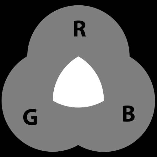
We are working in an RGB world when we stare at our monitors. Every single pixel is composed of 3 sub pixels of Red, Green, and Blue.
Now, variations in the brightness of each of the sub-pixels will "mix" to produce the colors we finally see. The scales available to us (in an 8-bit display), are levels from 0-255 for each color (28 = 256). So, if all the sub-pixel values are 0, you get black. If they are all 255, you'll see white. Any other combination will produce some variation on a color.
70, 203, 74 for instance
or 203, 70, 198
But what about 16-bit images?
Well - the data is still in the image file to correctly describe the colors at 16bit/channel, but most likely what you'll be seeing on your monitor is an interpolation of the values to an 8-bit/channel colorspace. You should always work in the highest bit depth color that you can, and leave any conversions to 8-bit for when you are saving your work to be viewed on a monitor only.
Well - the data is still in the image file to correctly describe the colors at 16bit/channel, but most likely what you'll be seeing on your monitor is an interpolation of the values to an 8-bit/channel colorspace. You should always work in the highest bit depth color that you can, and leave any conversions to 8-bit for when you are saving your work to be viewed on a monitor only.
The thing to take away from this is to realize that when all three color channels are the same value, you'll get a gray color. So middle gray of 127, 127, 127 would look like this:
127, 127, 127
While this is a little brighter: 225, 225, 225
Very quickly you should realize that a true monochromatic grayscale image can show you up to 256 discrete shades of gray (And for 16-bit, 216 will yield 65,536 different shades) going from 0 (pure black) to 255 (pure white). It is this limitation for purely gray 8-bit images that introduces artifacts in some images over smooth gradations (posterization or banding) - and is a good reason to keep your bit depths as high as possible.
In summary, realize that for a purely grayscale image, on an 8-bit monitor, you'll have 256 (visible) shades of gray to work with. (I say "visible" because if you're working in higher bit depths, the file will actually have many, many more shades of gray, but you'll still only be seeing 256 shades on your monitor).
Getting to Gray
There are many different paths to get to a grayscale image, and almost none of them are equal. They will all produce an image based on their different methods, and it will be up to you to decide which ones (or portions of) to keep and build on.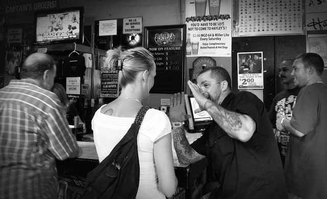
A combination of luminosity desaturation and GEGL Color2Grey (C2G).
12th Annual Dauphin St. Beer Fest - Conversation in Hayleys
For this tutorial I'm going to try to cover as many different methods as possible. This means we'll be having a look at:
- Desaturate Command (Lightness, Luminosity, Average)
- Channel Mixer
- Decompose (RGB, LAB)
- Pseudogrey
- Layer Blending Modes
- Combining of these methods
One of these methods may work fine for you. Or, if you're at all like me, it will most likely be a combination of one or more of these methods, blended through a combination of masking and opacity adjustments.
So in the first part of this tutorial we'll have a look at possibly the simplest and most straightforward method of converting your images to grayscale: Desaturate.
GIMP Desaturate
Perhaps the easiest and most straightforward path to a grayscale image is the Desaturate command. The command can be invoked from the Colors menu:Colors → Desaturate
There are three options available from this menu:

Each of these options will generate a grayscale image for you, but the difference lies in the way they interperet your image colors into values of gray.

Base RGB gradient of pure colors.

Base RGB (additive color) mix.
Lightness
Lightness will add the largest value of R, G, or B, and the smallest value, and divide the result by 2.1⁄2 × ( MAX(R,G,B) + MIN(R,G,B) )

Straight conversion yields similar values, regardless of color.
(Mouseover for color)
This means that (usually) one channel is actually ignored in the final result. The result will be a straight value conversion regardless of the color in consideration.
Average
Average will use the numerical average of the values of each pixel. (Again, regardless of the color in consideration).1⁄3 × ( R + G + B )

Averaging, the values will tend darker overall.

(Mouseover for color)
Luminosity
Luminosity is the most interesting of the straight desaturating methods. The reason lies in the way that our eyes perceive brightness in colors.Lightness and Average both evaluate the final value of gray as a purely mathematical function, without regard to the actual colors being used. Luminosity, on the other hand, utilizes the fact that our eyes will perceive green as lighter than red, and both as lighter than blues (relative luminance). This is also why your camera sensor (usually) has twice as many green detectors as red and blue.
(0.2126 × R) + (0.7152 × G) + (0.0722 × B)

This is closer to how our eyes will actually perceive brightness of the colors.

Notice the overwhelming contribution from green. (Mouseover for color)
I am not saying that any one of these is necessarily better for your conversion efforts. It depends on the desired results. However, if you are in doubt about which one to use – this is the best of the three options (to closest emulate what your eye will actually see).
A Couple of Examples
The image below, Joseph N. Langan Park, is an interesting example to see just how much green influences the conversion result in luminosity. Hover over the different conversion types in the caption to see them, and pay careful attention to what Luminosity does with the green bushes along the waters edge.


Mouseover type to see: Original - Lightness - Average - Luminosity
This shot of Whitney shows the effect on skin tones, as well as the change in her shirt color due to the heavy reds present. In just a Lightness conversion, the red shirt becomes relatively flat compared to her skin tones, but becomes darker and more pronounced using Luminosity. Her lips get a bit of a boost in tone in the Luminosity conversion as well.


Mouseover type to see: Original - Lightness - Average - Luminosity
Summary
There is no single right way to approach a B&W conversion overall, but hopefully this will give you some insights into how the GIMP Desaturate commands will view the data in your image.Remember, the goal is to use these tools to help you obtain an image that has the highest tonal density possible with your source. This image will then be the base for further adjustments of contrast and levels to achieve your final vision. You may find that different portions of your image respond better to different conversion techniques (and that's fine - I'll cover that in the last part of this tutorial when we begin mixing these results together).

Since you're going to explain the channel mixer next, I'll hold off on my comments. :-)
ReplyDeleteI'd wondered what "lightness" did as it sounded close to "luminance" .. your examples and mouse-overs are great, thanks.
ReplyDeleteThank you so much!!!
ReplyDeletePat,
ReplyDeleteThis summer I'm teaching an undergraduate online Digital Black & White course. There are some students using GIMP and PS Elements while I'm supporting PS CS6. Having found your 5-part GIMP B&W tutorials is the best I have found. I've posted your link in Moodle for my students. When I get back to the college this fall I will inquire if I can get authorization for a donation. Great Work. Dr. P
I'm new to GIMP and not a photographer or graphics professional. Thank you so much for providing some interesting and beautifully presented context for understanding GIMP.
ReplyDelete